Choosing the right siding color has become one of the most impactful decisions in modern homebuilding. The shade you choose influences how the home looks, how large it feels, and how well it fits the surrounding architecture. As exterior design trends continue to evolve, builders and homeowners are selecting popular siding colors that support lasting visual appeal and hold up to weather and light over time.
What Makes Certain Siding Colors So Widely Used
The most popular siding colors today are chosen for both appearance and long-term performance. A great color adapts well to shifting light, regional climates, and changing tastes. Homeowners want something that won’t feel dated in five years or show signs of fading after just one season.
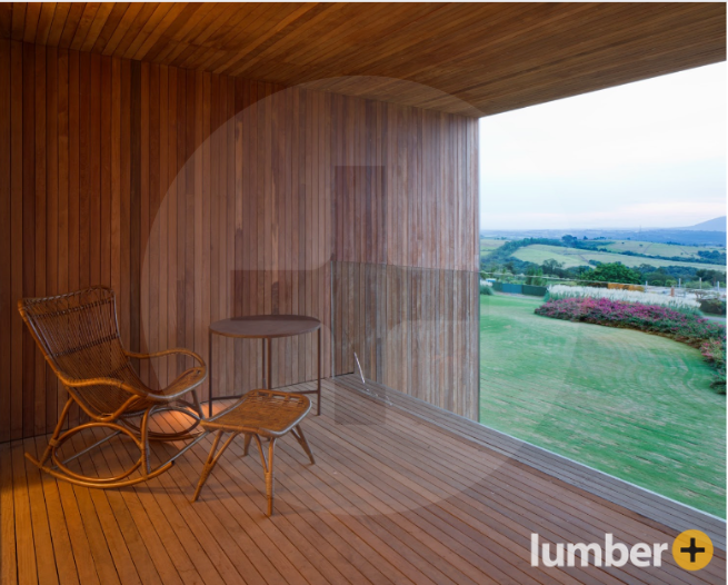
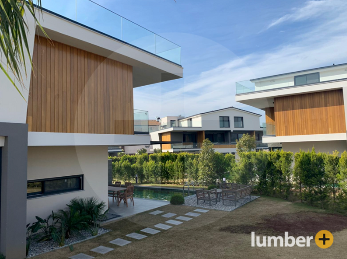
Rather than relying on bold or high-gloss finishes, today’s leading tones are anchored in muted grays, mid-range browns, and naturally weathered wood looks. These colors serve as a neutral canvas for other design elements like trim, windows, and roofing. They work equally well with both traditional and modern architectural styles.
Why Material Matters Just as Much as Tone
Color is only as good as the material it’s built into. Composite siding systems, including options like NORX offered through Lumber Plus, embed color directly into the board. This protects it from the kind of peeling, cracking, or sun bleaching that plagues painted surfaces.
Matte and textured finishes also play a role. Smooth siding tends to reflect light unevenly, often resulting in visible hot spots or sheen variation. By contrast, grained composite profiles scatter light in a more controlled way. This creates a natural, dynamic appearance under full sun or cloudy skies alike.
Fade Resistance Is the Foundation of Long-Term Performance
It’s easy to underestimate how quickly UV exposure can break down pigment—especially in lighter or warmer shades. That’s why many of today’s most popular siding colors are manufactured using fade-resistant compounds designed for multi-decade stability.
High-performance composite colors are engineered to maintain tone across freeze-thaw cycles, direct sun, and high humidity. Instead of applying color to the surface alone, the pigment is bonded throughout the board. This eliminates blistering and color fade, even after years of exposure.
9 Popular Siding Colors That Are Working on Real Homes
Each of the colors below is available through Lumber Plus as part of its composite siding collection. These reflect what designers, builders, and homeowners are choosing today—not just for appearance, but for how the color performs on real homes.
1. Charcoal – Crisp Modern Lines
Charcoal remains one of the strongest performers in urban and modern residential builds. It sharpens visual edges, contrasts well with metal and stone, and supports low-profile trim details.
2. Graphite – Cooler, Softer Depth
Graphite offers a less saturated version of deep gray that feels softer under changing light. It pairs easily with warm wood accents or white-framed windows.
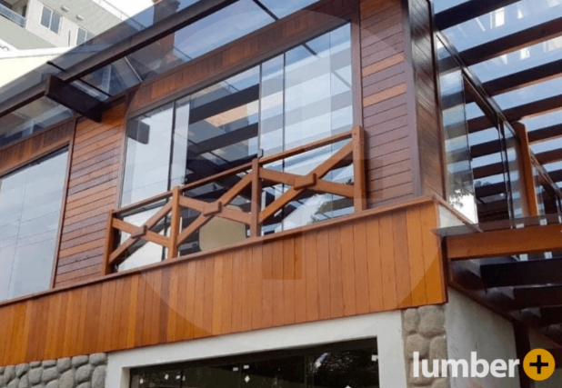
3. Driftwood – Coastal and Weathered
This shade resembles sun-aged wood with a gray undertone. It’s an ideal choice for coastal builds, lake houses, and designs that feature open porch areas or exterior beams.
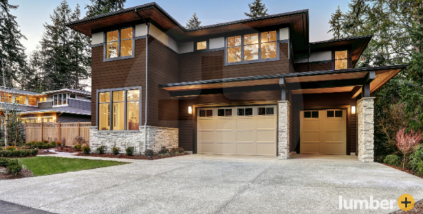
4. Agedwood – Warm Mid-Brown with Grain Depth
Agedwood mimics the appearance of seasoned hardwood siding. It works well in mountain environments and blends with natural stone or dark bronze metals.
5. Hazelwood – Soft, Balanced Neutral
Hazelwood sits between tan and taupe. It’s favored for its flexibility—able to pair with both traditional gables and flat, modern cladding panels.
6. Oakwood – Natural Light Timber Look
Oakwood carries the visual cues of unfinished hardwood, without the maintenance that real wood requires. This makes it an excellent option for homeowners who want warmth without upkeep.
7. Sand – Light, Earth-Toned Simplicity
Sand is a time-tested siding tone often used in transitional homes. It enhances the appearance of arched entries, stucco accents, and terracotta roofing.
8. Espresso – Saturated and Structural
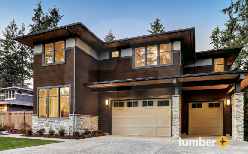
Espresso siding adds density to a home’s profile. It suits modern builds with sharp corners, minimal trim, and large-pane glazing.
9. Ironwood – Bold with Organic Texture
Ironwood delivers deep brown contrast while avoiding a blacked-out effect. It plays especially well with vertical siding formats and shadow line trim reveals.
Matching the Right Tone to the Right Environment
The same color can behave differently depending on setting, orientation, and surrounding materials. A tone like Graphite may feel sleek and minimalist in a suburban context but appear muted against heavy tree cover or red clay soil.
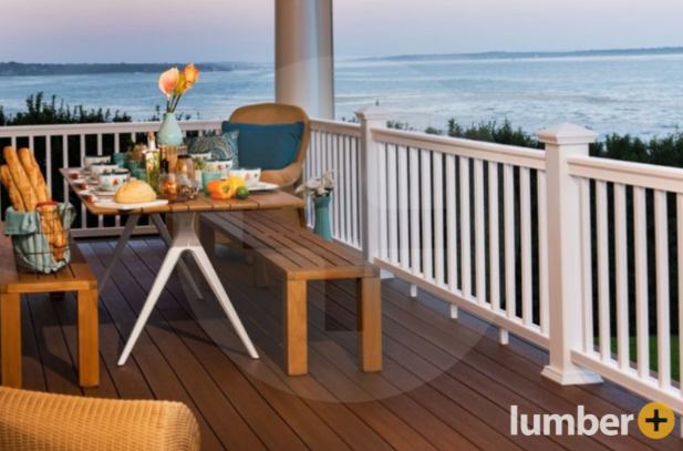
In full-sun areas, lighter colors like Sand or Driftwood help reduce thermal absorption and glare. In contrast, deeper tones such as Espresso or Ironwood are well suited to wooded or overcast environments. These darker shades often pair well with matte black windows and dark bronze hardware.
Choose High-Performance Siding Colors from Lumber Plus
Lumber Plus offers nine composite siding colors that are engineered to last and designed to elevate architectural curb appeal. These popular siding colors are tested for fade resistance, material stability, and design flexibility across climates and home styles.
Contact us today for more information.